library(ggfoundry)
library(tibble)
library(forcats)
library(stringr)
library(dplyr)
library(paletteer)
library(scales)
library(palmerpenguins)
library(rpart)
library(ggdendro)
Display a palette
A large collection of palettes are brought together under a single interface by the paletteer package. It’s used here to load the Van Gogh palette “Starry Night”.
ggfoundry’s display_palette() shows the loaded palette
with associated hex codes using the default shape jar from
the container set. The outline colour defaults to mid-grey
for better dark-mode support as per this example post.
pal_name <- "vangogh::StarryNight"

pal <- paletteer_d(pal_name)

display_palette(pal, pal_name)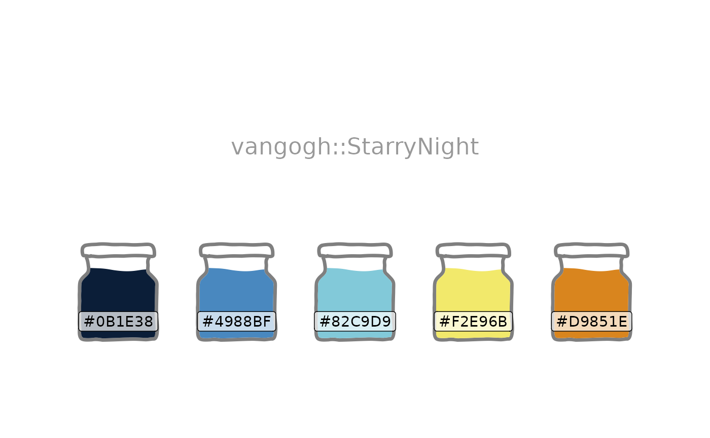
Sunflower plot
Using the palette exhibited above, and inspired by this python
Stack Overflow answer, sunflower shapes combined with
geom_hex() make possible this kind of ggplot.
Each additional petal reflects an increased range in the count values
as shown in the legend. And the choice of ggplot2 cut,
i.e. cut_number(), cut_interval() or
cut_width(), provides flexibility in how these ranges are
constructed.
shapes <- shapes_cast() |>
  filter(set == "flower") |>
  pull(shape)

ggplot(diamonds, aes(carat, price)) +
  geom_hex(bins = 10, colour = pal[3]) +
  geom_casting(
    aes(
      shape = cut_number(after_stat(count), 8, dig.lab = 4),
      group = cut_number(after_stat(count), 8)
    ),
    size = 0.12, bins = 10, stat = "binhex", colour = pal[1], fill = pal[4]
  ) +
  scale_shape_manual(values = shapes) +
  scale_y_continuous(labels = label_currency(scale_cut = cut_short_scale())) +
  scale_fill_gradient(
    low = pal[2], high = pal[1],
    labels = label_number(scale_cut = append(cut_short_scale(), 1))
  ) +
  labs(
    title = "Sunflower Plot",
    shape = "Count\nIntervals",
    fill = "Counts", y = "Price", x = "Carat"
  ) +
  theme_bw()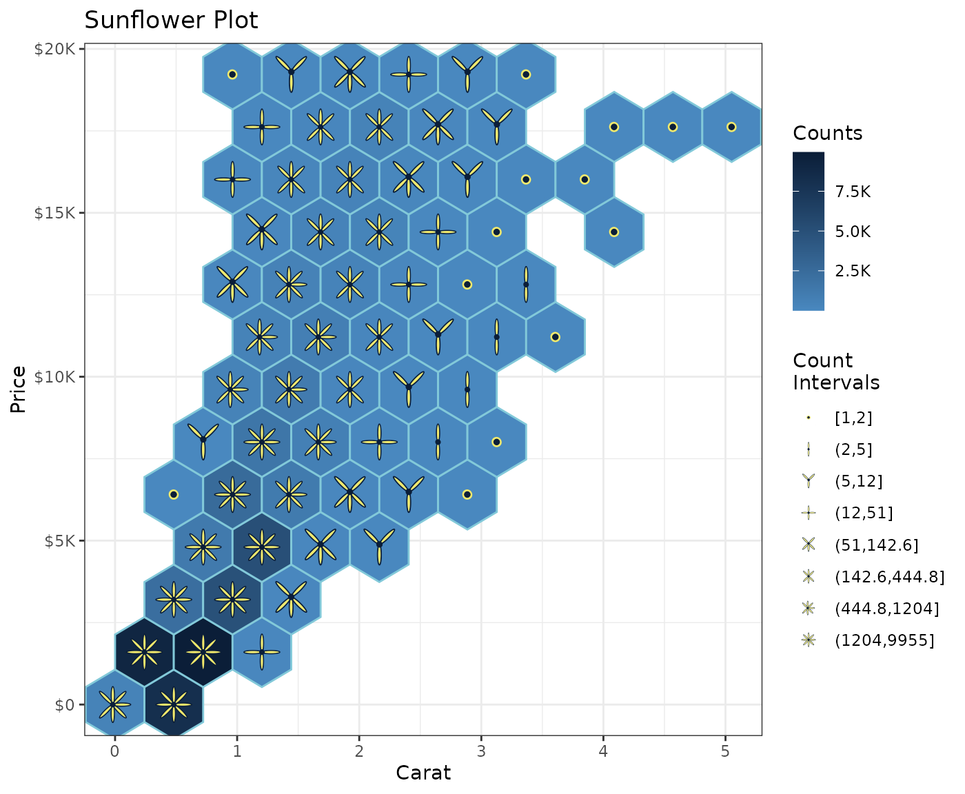
Shapes identified by data
In the sunflower plot, scale_shape_manual() specifies
the desired shapes. Alternatively, the data may already specify their
identity as illustrated below using Allison Horst’s palmerpenguins
dataset and ggfoundry’s penguin-set shapes.
count_df <- penguins |>
  filter(!is.na(body_mass_g)) |>
  mutate(
    species = str_to_lower(species),
    cut_mass = cut_width(body_mass_g, width = 500, dig.lab = 4)
    ) |>
  count(species, island, cut_mass)

count_df |>
  ggplot(aes(species, cut_mass, fill = species)) +
  geom_casting(aes(shape = species), size = 0.25) +
  geom_text(aes(label = n), size = 3, nudge_y = 0.2, nudge_x = 0.1) +
  scale_discrete_identity(aesthetics = "shape", guide = "legend") +
  facet_wrap(~island, scales = "free_x") +
  labs(
    title = "Palmer Penguins",
    subtitle = "Counts by Species, Island & Body Mass Ranges",
    shape = NULL, fill = NULL, x = NULL, y = "Body Mass (g)"
    ) +
  theme_bw() +
  theme(
    axis.text.x = element_blank(),
    axis.ticks.x = element_blank()
    ) +
  guides(shape = guide_legend(override.aes = list(size = 8)))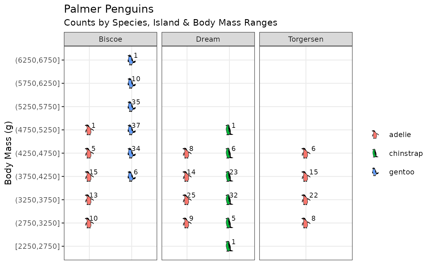
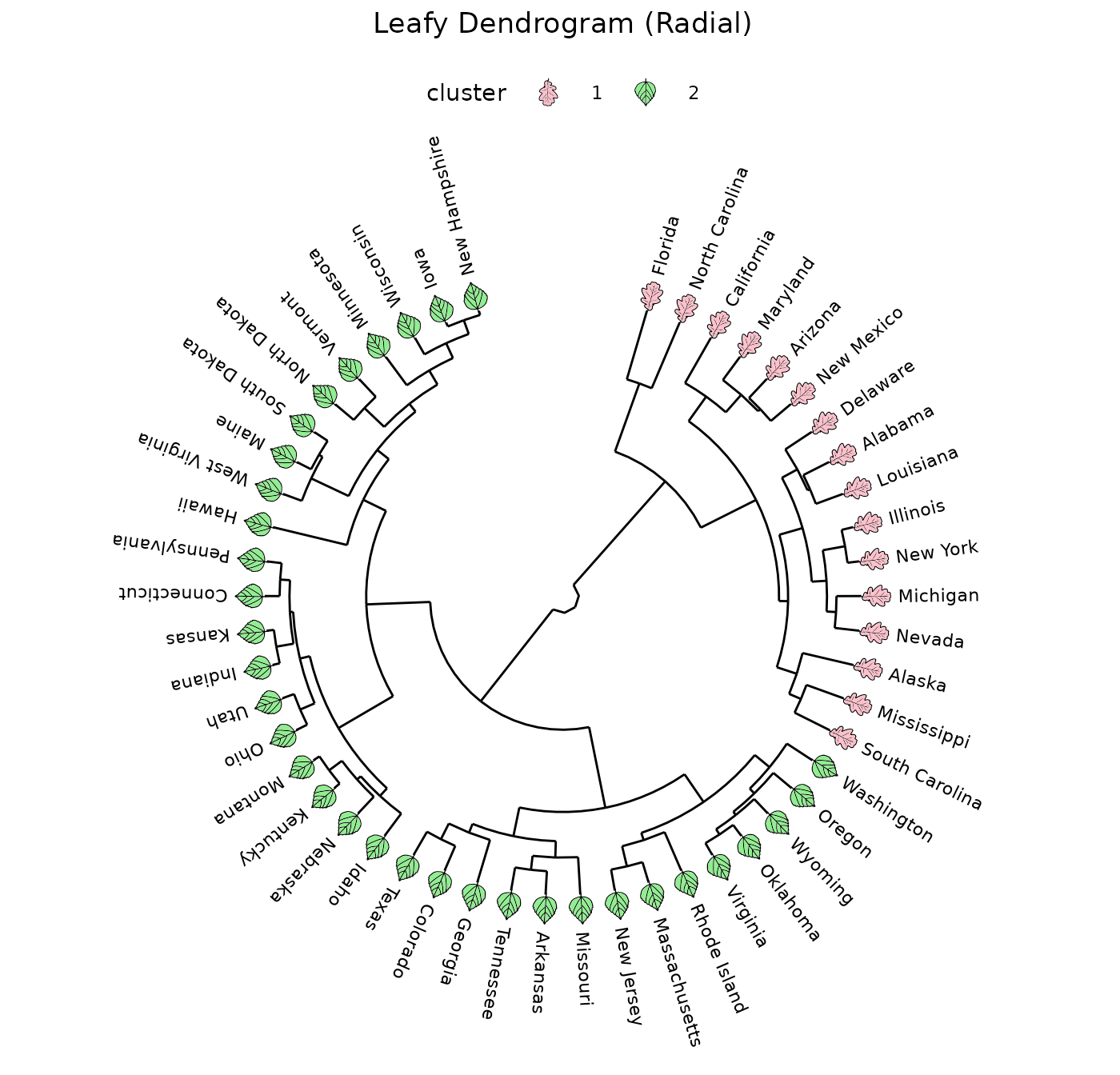
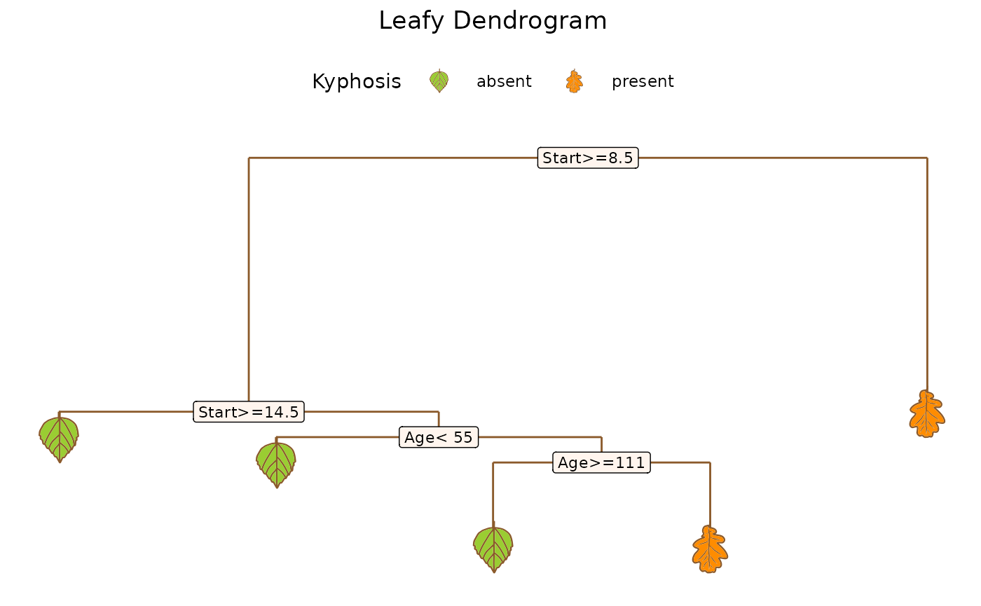
Leafy dendrograms
Adding appropriate filled shapes to a dendrogram can help draw attention to important groupings.
Cartesian
Shapes from ggfoundry’s “leaf” set are used here to augment a ggdendro plot of an rpart tree.
data <-
  rpart(Kyphosis ~ Age + Number + Start, data = kyphosis) |>
  dendro_data()

ggplot() +
  geom_segment(
    aes(x, y, xend = xend, yend = yend),
    colour = "tan4", data = data$segments,
  ) +
  geom_label(
    aes(x, y, label = label),
    size = 3, fill = "seashell", data = data$labels) +
  geom_casting(aes(x, y, shape = label, fill = label),
               colour = "tan4", size = 0.27, data = data$leaf_labels) +
  scale_shape_manual(values = c("hibiscus", "oak")) +
  scale_fill_manual(values = c("olivedrab3", "darkorange")) +
  labs(
    title = "Leafy Dendrogram (Cartesian)",
    shape = "Kyphosis", fill = "Kyphosis"
    ) +
  theme_dendro() +
  theme(
    plot.title = element_text(hjust = 0.5),
    legend.key.size = unit(2, "line"),
    legend.position = "top"
    )
Radial
Using ggfoundry’s angle and vjust
arguments, we could visualise a radial dendrogram with the leaves
rotated consistent with the branches.
data <- hclust(dist(USArrests), "ave") |>
  dendro_data(type = "rectangle")

cluster <- hclust(dist(USArrests), "ave") |>
  cutree(k = 2) |>
  as_tibble(rownames = "label") |>
  mutate(cluster = factor(value), .keep = "unused")

num_leaves <- nrow(data$labels)
offset <- 15 # Degrees by which the first branch is rotated
from <-  90 - offset # First text label
by <- -(360 - (2 * offset)) / (num_leaves - 1) # Degrees between labels

leaves <- data$labels |>
  mutate(
    angle = seq(from = from, by = by, length.out = num_leaves),
    shape_angle = seq(from + 90, by = by, length.out = num_leaves),
  ) |>
  left_join(cluster, join_by(label))

ggplot() +
  geom_segment(
    aes(x = x, y = y, xend = xend, yend = yend),
    data = segment(data)
  ) +
  geom_text(
    aes(x = x, y = y, label = label, angle = angle),
    size = 3, hjust = 0, nudge_y = 20, data = leaves
  ) +
  geom_casting(
    aes(x, y, angle = shape_angle, group = x, fill = cluster, shape = cluster),
    vjust = 0.7, size = 0.08, data = leaves
  ) +
  scale_y_reverse() +
  scale_fill_manual(values = c("pink", "lightgreen")) +
  scale_shape_manual(values = c("oak", "hibiscus")) +
  labs(title = "Leafy Dendrogram (Radial)") +
  coord_radial() +
  theme_dendro() +
  theme(
    plot.title = element_text(hjust = 0.5),
    legend.key.size = unit(2, "line"),
    legend.position = "top"
    )